Core discipline AQOMI led on the Jerry project.
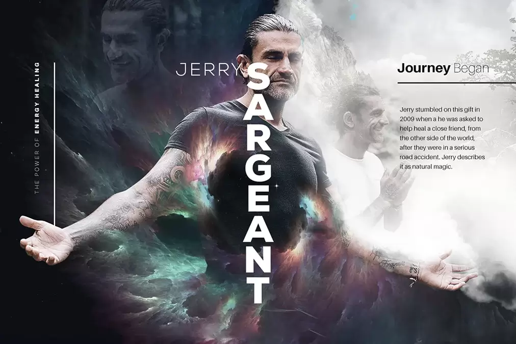
Jerry
Sargeant.
Authority, spirituality and transformation in one system.
Jerry Sargeant
AQOMI Studios
AQOMI Studios
From a brief in wellness
to one recognizable brand.
Complete personal brand system and digital presence for author and speaker Jerry Sargeant. AQOMI built a visual identity that communicates authority, spirituality, and transformation.
The brand operates in wellness, speaking to readers, event-goers and community members.
Full creative direction, from strategy to finished applications.
Strategy
Make the brand
impossible to ignore.
The brand needed to feel both approachable and elevated — drawing readers and event-goers into a world built around healing, growth, and possibility.
One clear story.
Connect every touchpoint into a single, coherent narrative instead of disconnected assets — so readers, event-goers and community members instantly understand who they are.
Stand apart.
Give the brand a distinctive visual signature that separates it from everything else in wellness and earns a second look.
A repeatable system.
Establish logo, typography and colour rules that stay consistent from the first impression to the hundredth.
Built for every surface.
Design a system that travels cleanly from digital to print, campaign and environment without losing its character.
A voice
A speaker and author.
New direction
A movement people join.
The work
The system,
in the world.
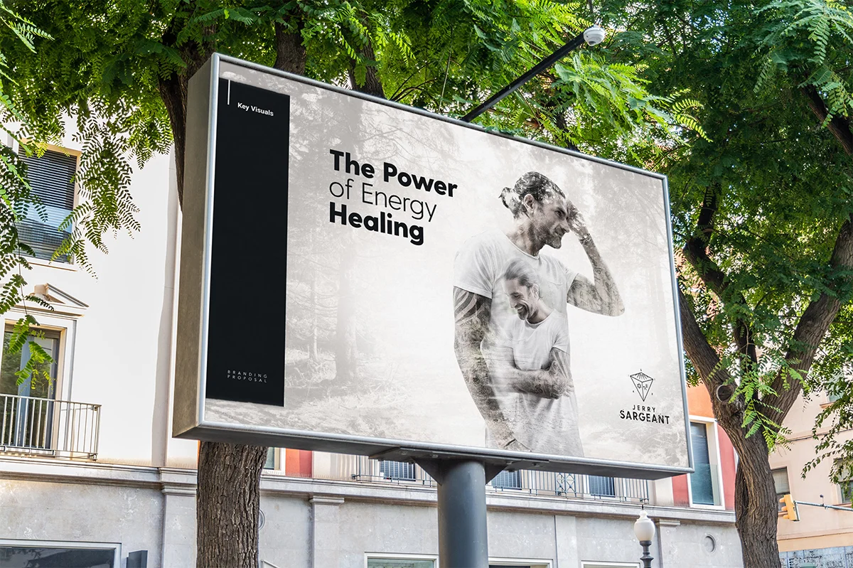
Selected Jerry visuals from the AQOMI project — identity, key visuals and applied brand.

What the system enables
What a coherent
system unlocks.
The Jerry system is designed to support recognition, hierarchy, reuse and growth across every touchpoint.
01
Brand recognition.
A consistent logo, palette and type hierarchy create a signature the audience remembers.
02
Clear hierarchy.
Information and imagery sit inside one visual architecture, easy to read at any scale.
03
Cross-channel reuse.
The same system extends from web to print, social and physical applications.
04
Room to grow.
A flexible foundation the brand can build on as it expands into new markets and formats.
Delivery
Not just a logo.
A working system.
A brand system that stays coherent across identity, digital, campaign and physical use.
Identity.
Primary and secondary logo use
Clear-space and proportion rules
Colour and monochrome variants
Responsive brand marks
Visual system.
Colour palette
Typography hierarchy
Graphic and image direction
Art-direction guidelines
Digital.
Website visual consistency
Key content modules
Social templates
Campaign adaptations
Applications.
Print and collateral
Environmental and large-format
Presentation systems
Consistent use at scale
Your brand.
Next.
Like Jerry, your brand can move from a brief to a system people recognize. Let's build it.