Core discipline AQOMI led on the WeExchange project.
WeExchange.
A clean, memorable identity for a national money exchange.
WeExchange
AQOMI Studios
AQOMI Studios
From a brief in fintech
to one recognizable brand.
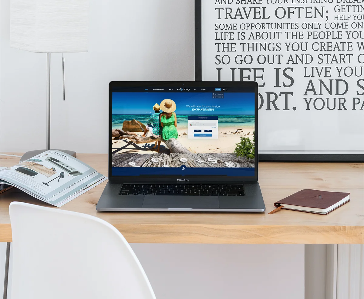
WeExchange is a national money exchange based in Australia. They approached us for a modern website design and a clean, minimal look that would stand out in a crowded financial services market.
The brand operates in fintech, speaking to people moving money across borders.
Full creative direction, from strategy to finished applications.
Strategy
Make the brand
impossible to ignore.
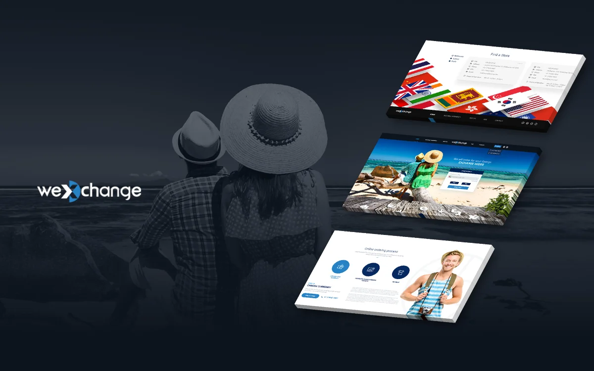
We focused on small details that make a big difference — including flag icons for every supported currency, giving the interface a memorable quality that matched the brand's global ambitions.
One clear story.
Connect every touchpoint into a single, coherent narrative instead of disconnected assets — so people moving money across borders instantly understand who they are.
Stand apart.
Give the brand a distinctive visual signature that separates it from everything else in fintech and earns a second look.
A repeatable system.
Establish logo, typography and colour rules that stay consistent from the first impression to the hundredth.
Built for every surface.
Design a system that travels cleanly from digital to print, campaign and environment without losing its character.
Before
A crowded market.
New direction
A memorable fintech brand.
The work
The system,
in the world.
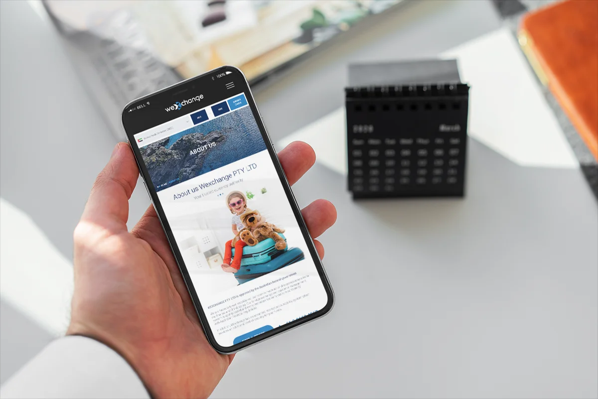
Selected WeExchange visuals from the AQOMI project — identity, key visuals and applied brand.
What the system enables
What a coherent
system unlocks.
The WeExchange system is designed to support recognition, hierarchy, reuse and growth across every touchpoint.
01
Brand recognition.
A consistent logo, palette and type hierarchy create a signature the audience remembers.
02
Clear hierarchy.
Information and imagery sit inside one visual architecture, easy to read at any scale.
03
Cross-channel reuse.
The same system extends from web to print, social and physical applications.
04
Room to grow.
A flexible foundation the brand can build on as it expands into new markets and formats.
Delivery
Not just a logo.
A working system.
A brand system that stays coherent across identity, digital, campaign and physical use.
Identity.
Primary and secondary logo use
Clear-space and proportion rules
Colour and monochrome variants
Responsive brand marks
Visual system.
Colour palette
Typography hierarchy
Graphic and image direction
Art-direction guidelines
Digital.
Website visual consistency
Key content modules
Social templates
Campaign adaptations
Applications.
Print and collateral
Environmental and large-format
Presentation systems
Consistent use at scale
Your brand.
Next.
Like WeExchange, your brand can move from a brief to a system people recognize. Let's build it.